Project Airbender
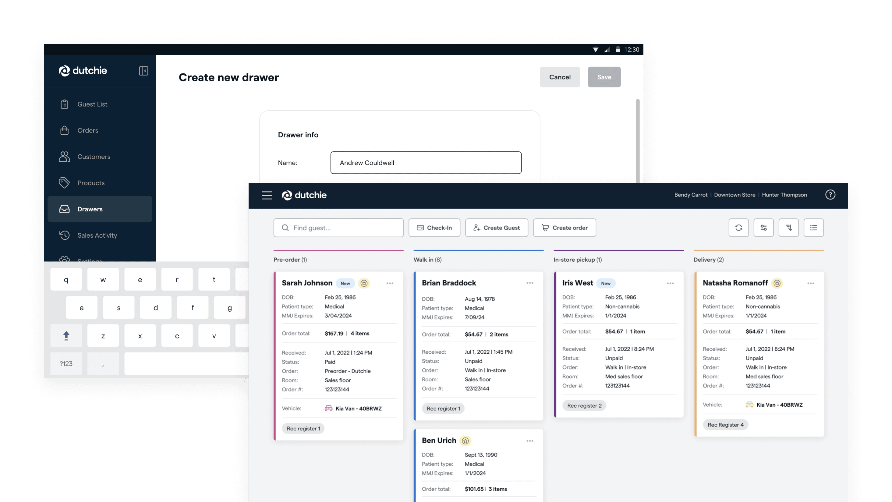
Systemized and scaled a new design language to unify two acquired point of sale platforms into a cohesive Dutchie Point of Sale experience across devices.
Case study
Context
Dutchie powers the cannabis industry with point of sale, e-commerce, payments, and marketing tools. In 2021, the company acquired Leaflogix and Greenbits to expand their in-store retail operations.
Both platforms were mature and widely used, but built with different design languages, interaction models, and assumptions about retailer workflows. At the same time, cannabis retail introduces strict regulatory and reporting requirements that add significant operational complexity.
I led the design system work for the integration: shaping the new visual language into a scalable, production-ready system that could unify both products and support cross-functional execution.
acquired platforms unified
device form factors
retailers served
states with regulatory variance
Problem
Dutchie needed to unify two long-established point of sale systems into a single cohesive experience — without losing retailer trust or breaking the regulatory workflows the platforms enabled.
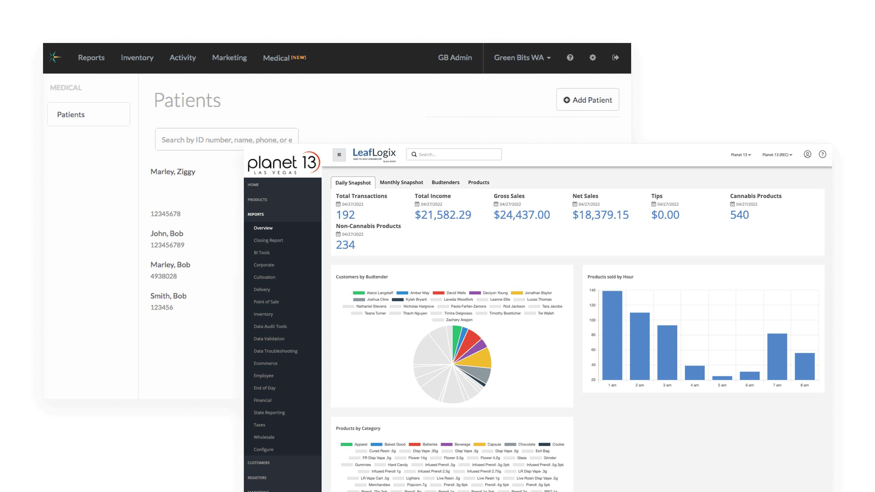
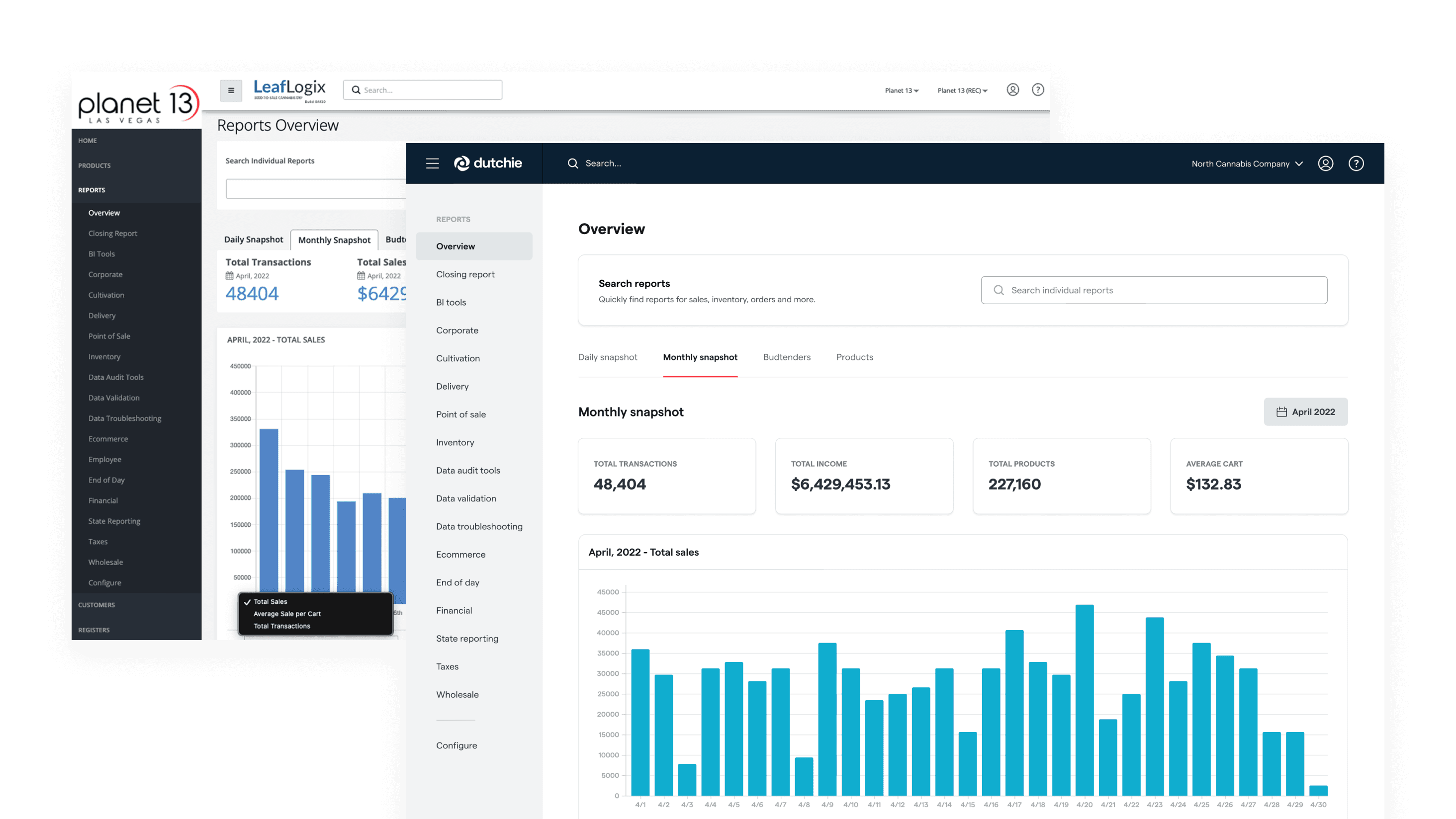
Leaflogix served large enterprise dispensaries with deep operational requirements, while Greenbits focused on smaller retailers with streamlined workflows. Their UX patterns, visual systems, and feature depth differed significantly.
Without a shared system foundation, teams rebuilding front of house and back office experiences across devices would face inconsistency, rework, and slipping timelines.
Solution
Project Airbender was a foundational systems initiative — the first time these two platforms would share a design language. The work had to balance clarity, scalability, and the speed needed to consolidate the brand without splitting customers across two products longer than necessary.
Early in the work, we faced a strategic question: which platform should serve as the foundation for the new shared experience? Greenbits had the cleaner UI, but Leaflogix had the deeper functionality that larger dispensaries depended on. We chose Leaflogix as the base. Complex enterprise functionality is harder to recreate than UI flaws are to fix, and a ground-up rebuild would have kept customers split across two platforms while we evaluated, designed, and rebuilt. Using Leaflogix as a foundation let us modernize the UI, ship the consolidated experience faster, and iterate once retailers were using it.
Learning the products and identifying patterns
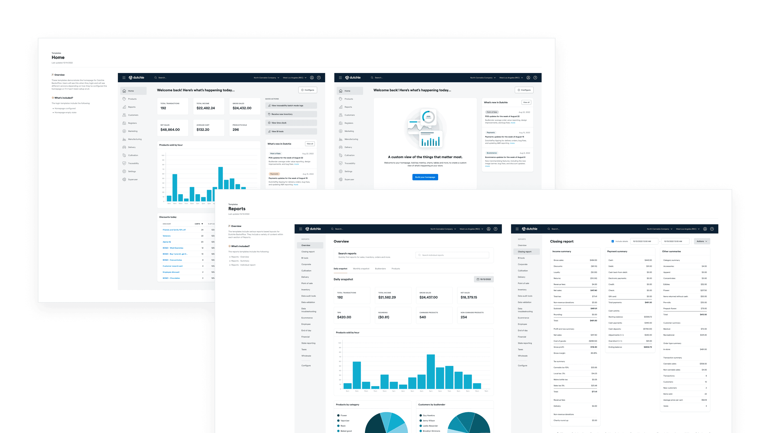
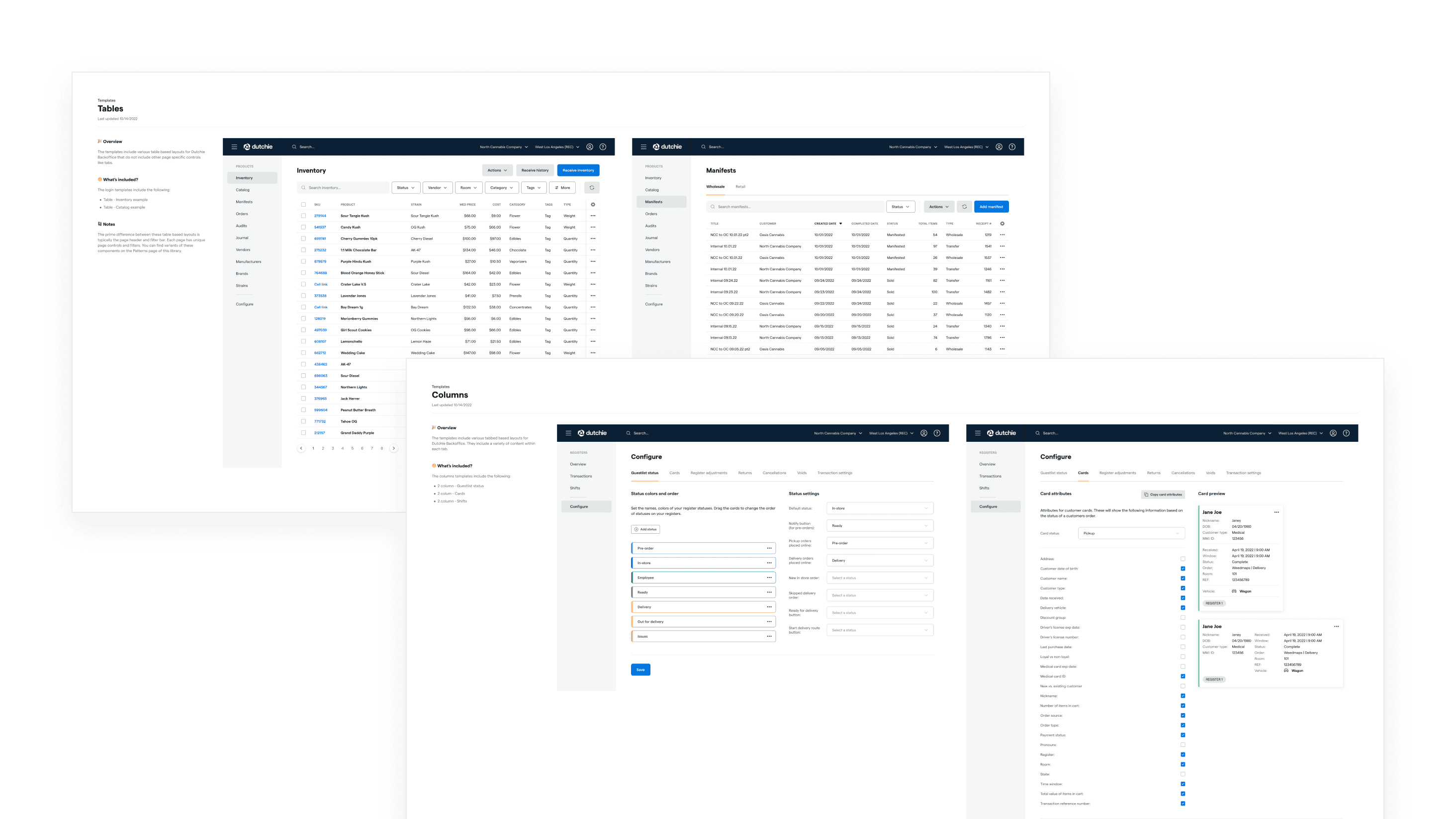
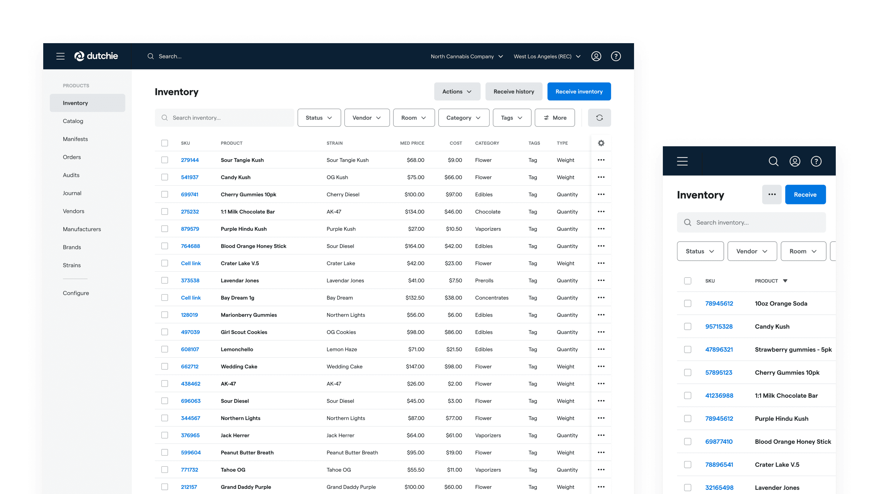
Before making structural decisions, I spent significant hands-on time inside both products and visited retailers to observe how dispensaries actually used them. That immersion helped me identify the recurring page types that could be templated rather than designed from scratch each time: table-based listings, individual object pages, and reporting screens. Grounding the system in real workflows, not abstract patterns, was what made the next phase of work move quickly.
Establishing a flexible component foundation
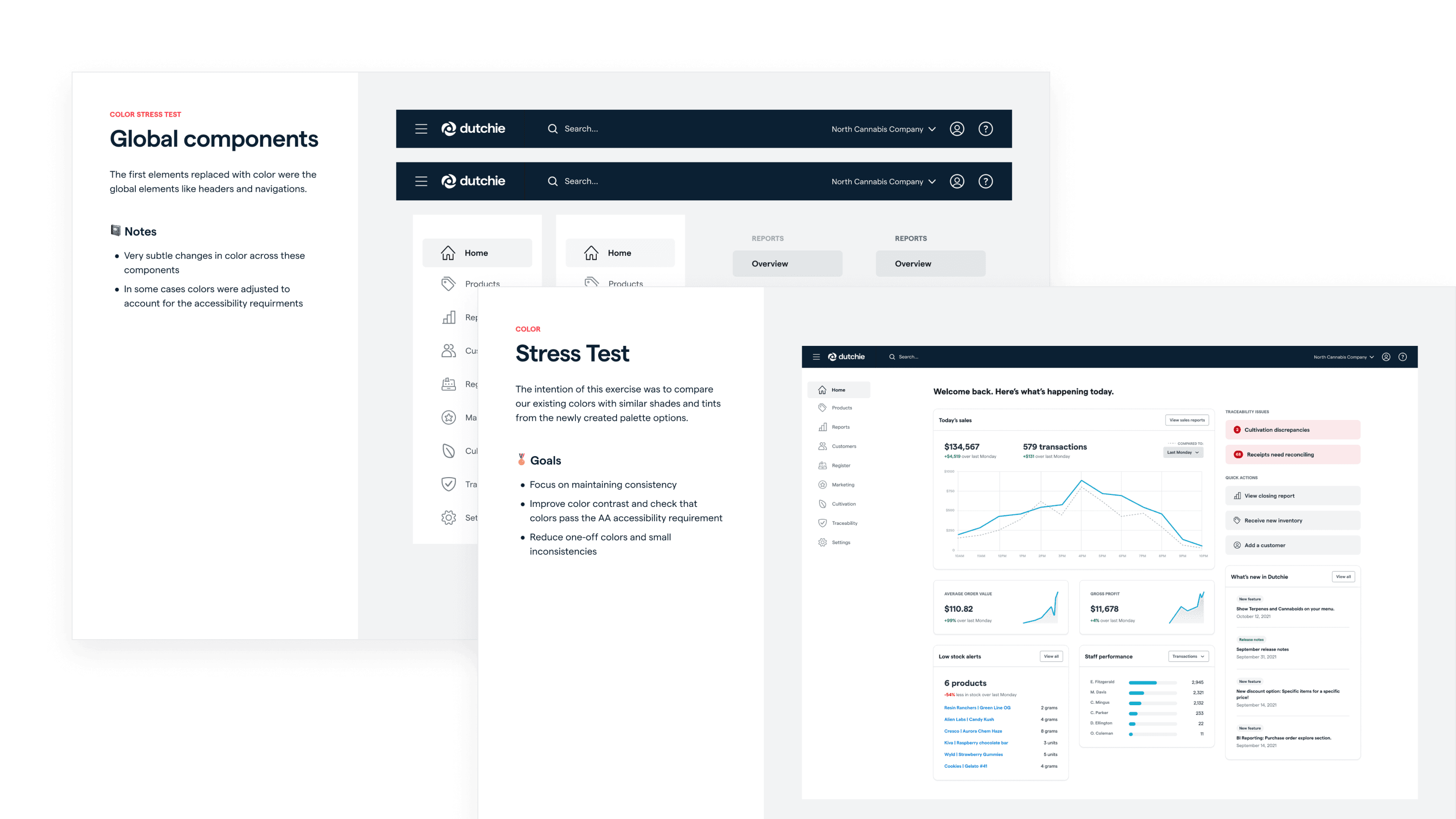
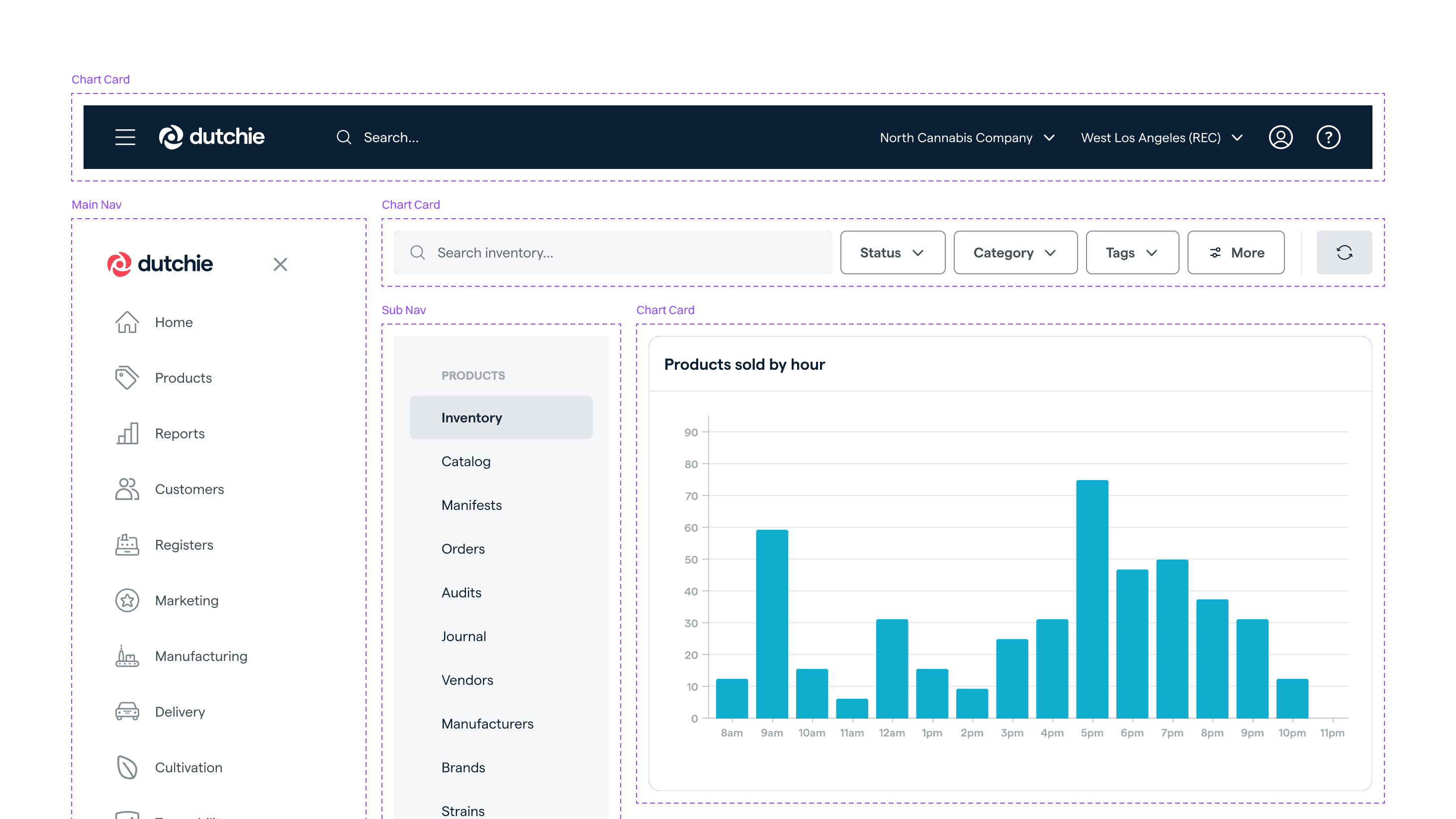
Working closely with engineering, we built navigation and hierarchy components to support deeply nested back office environments — top-level nav, sub-navs, tabs, and patterns for nested objects. I reinforced shared decisions through the components themselves and through engineering reviews, especially as we moved fast and translated the new design language on top of Leaflogix's existing patterns.
Tables were rebuilt as modular, column-based components rather than row-based. Composing by columns gave designers more flexibility: they could reorder or add columns in Figma using auto-layout without rebuilding every row. This single decision made it dramatically faster to reconstruct Leaflogix pages in the new design language.
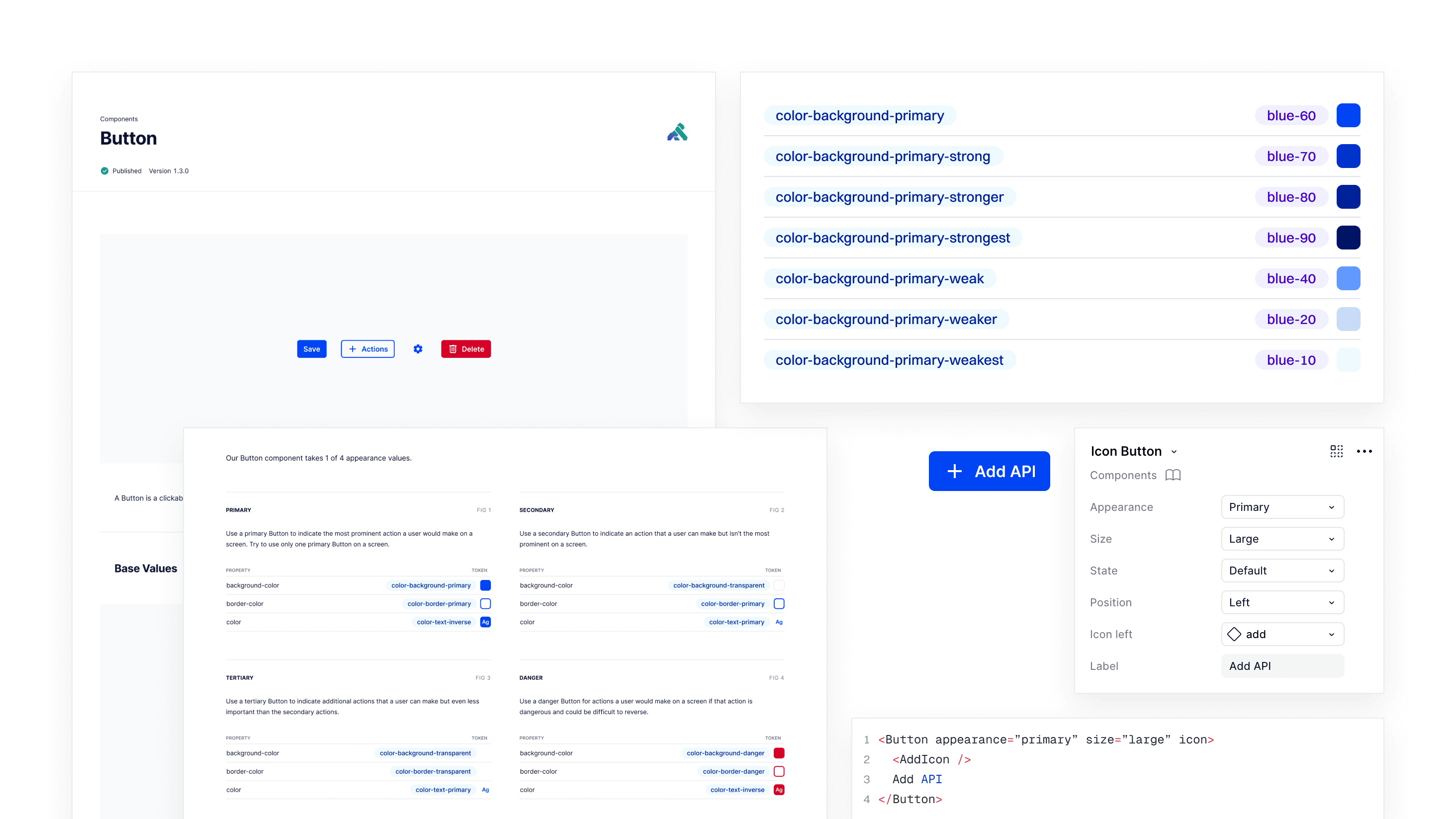
I partnered with engineering to define the initial token structure and shifted designers toward consistent token usage in Figma, which made global adjustments possible as the system evolved.
Systemizing the design language
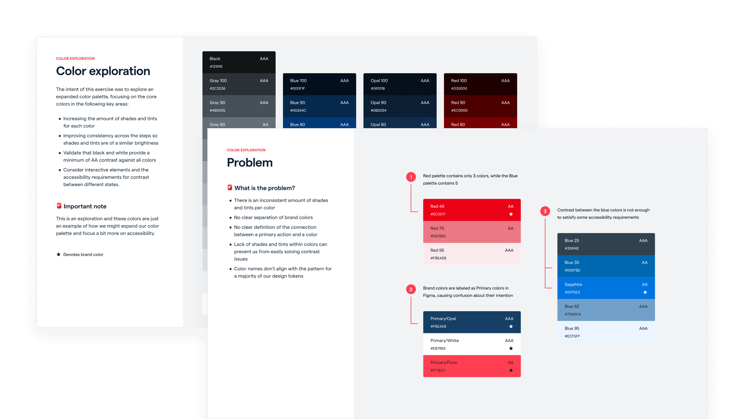
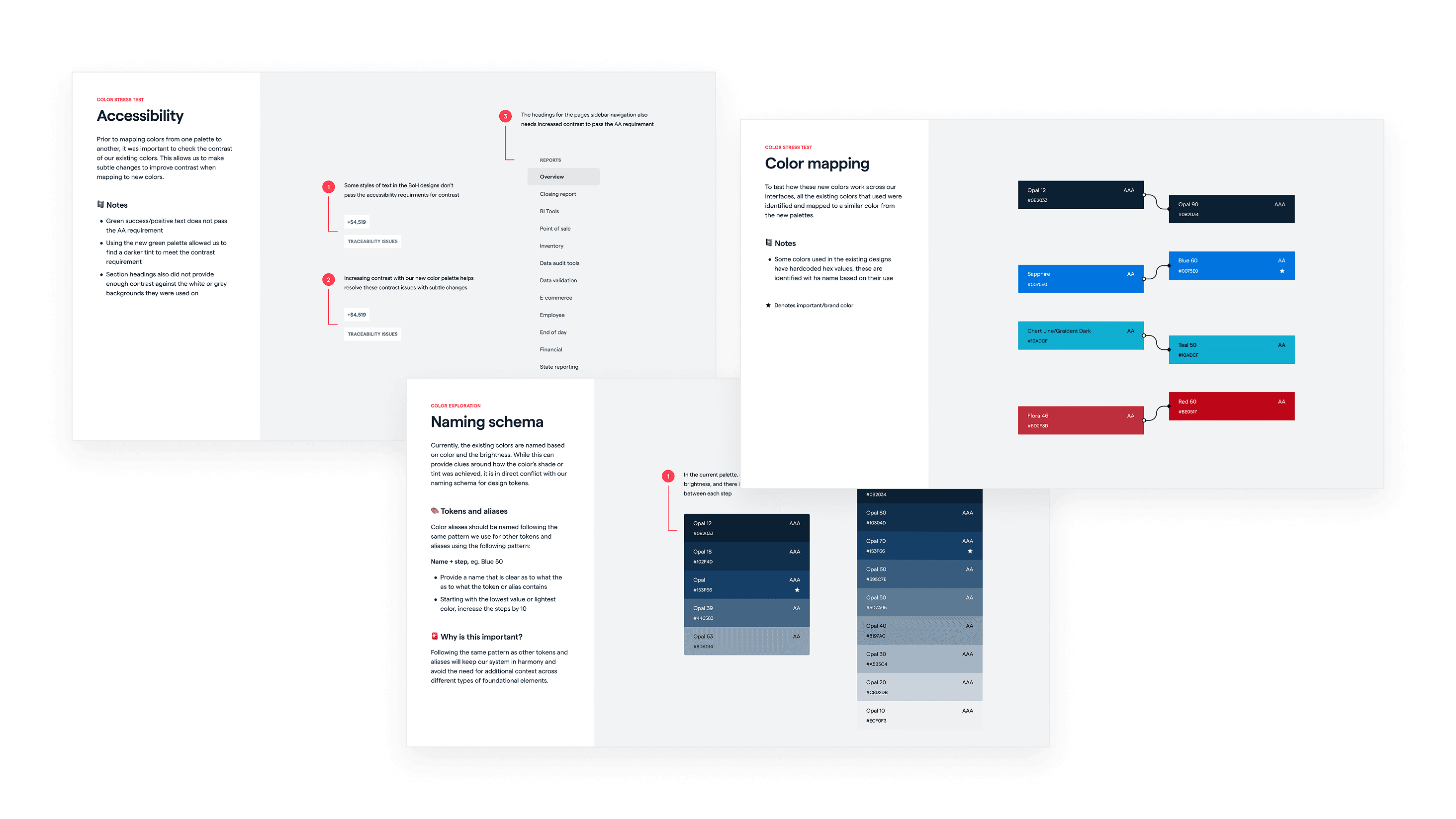
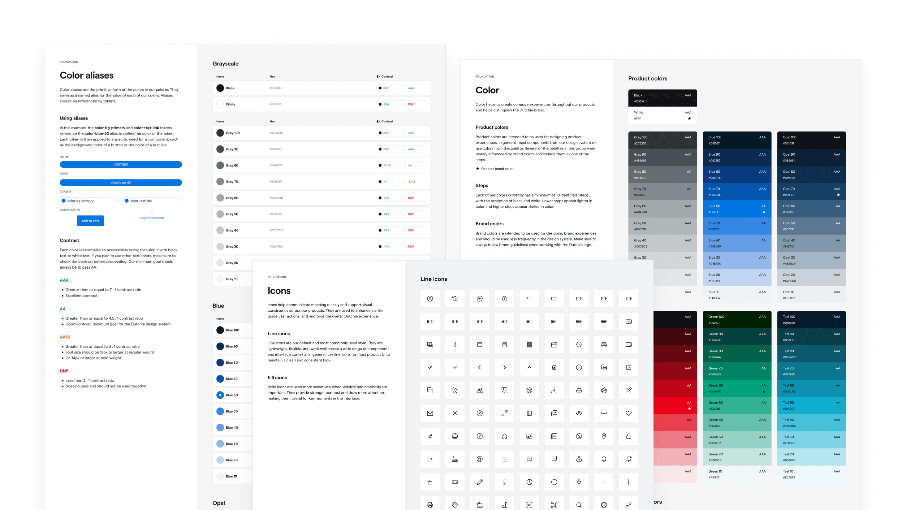
Working from initial creative direction set by the founder, I built the structured, production-ready system that turned the vision into something teams could actually ship with. I formalized accessible color scales, spacing systems, and reusable components capable of supporting both data-dense back office workflows and streamlined transactional screens.
Impact
Over six months, this work established the foundation for Dutchie Point of Sale and enabled teams to execute quickly under tight timelines.
components in the production system
patterns of reusable structures
designers and engineers consuming the system
PR previews and contributions across engineering repos
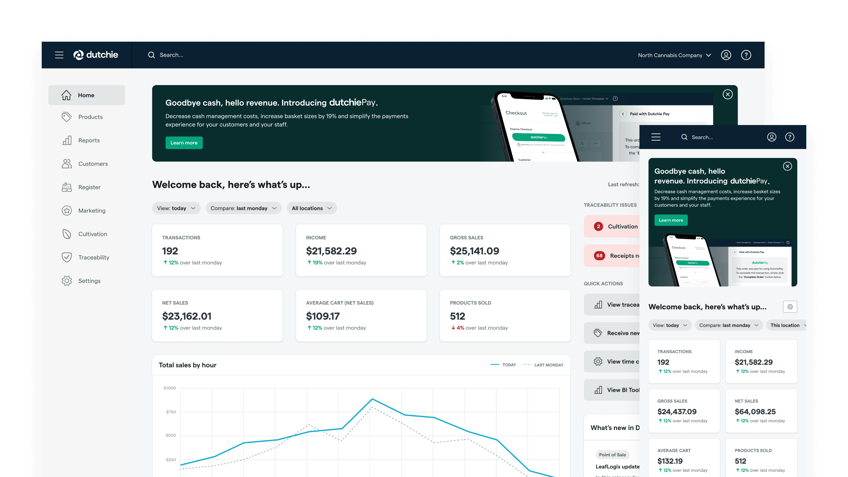
The unified system reduced fragmentation between Leaflogix and Greenbits, gave retailers a single cohesive Dutchie experience, and gave product teams a shared foundation to build on. Designers were supported with clear templates and patterns. Engineering had consistent tokens and reliable parity between Figma and code. The design-engineering partnership, anchored in shared review and contribution, accelerated execution under tight timelines.
Retailer feedback after launch was largely positive — the new design language felt more modern and easier to navigate. There were growing pains: longtime users had to re-learn workflows they'd built muscle memory around, and some retailers wanted more information density than the new visual language offered by default. We responded with a fast follow that let retailers adjust density in tables and other data-dense screens, balancing the modern aesthetic with the operational throughput power users needed.
Beyond the launch, the system became a durable foundation for future expansion across devices and workflows.
Learning
This project reinforced the tradeoffs involved in speed, especially when unifying complex and mature products. The big-bang release created a strong visual moment for the brand, but a more incremental rollout would have reduced friction and improved outcomes.
In hindsight, I would have prioritized redesigning a small set of high-impact workflows first and validating the new direction with a group of trusted customer advocates before scaling it across the entire product. Designing and implementing in parallel under time pressure created moments where engineering felt blocked or lacked clarity on edge cases. A more staged approach could have improved alignment between disciplines, reduced rework, and given the team room to validate the complex back office workflows that mattered most.
The experience shaped how I think about system rollouts today. Strong design systems are not just about visual cohesion, but about sequencing change thoughtfully, creating feedback loops early, and ensuring teams are not forced to trade clarity for speed.
Credits
This work was made possible through close collaboration with product, design, and engineering partners. Special thanks to Zach, Lauren, Cory, Teddy, Jordan, and Evan.